Brampton London is an English label that crafts timeless leather goods for individuals who are unafraid to go on a journey of self-discovery and express themselves.
My Role
Visual Designer
Contributed to brand identity development, created unique product patterns, and designed desktop interface.
Time Frame
Feb - Sept 2023
Skills
Brand Identity
Packaging Design
Web Design
Teams
1 Creative Head
2 Designer
1 Copywriter
2 Developers
Overview
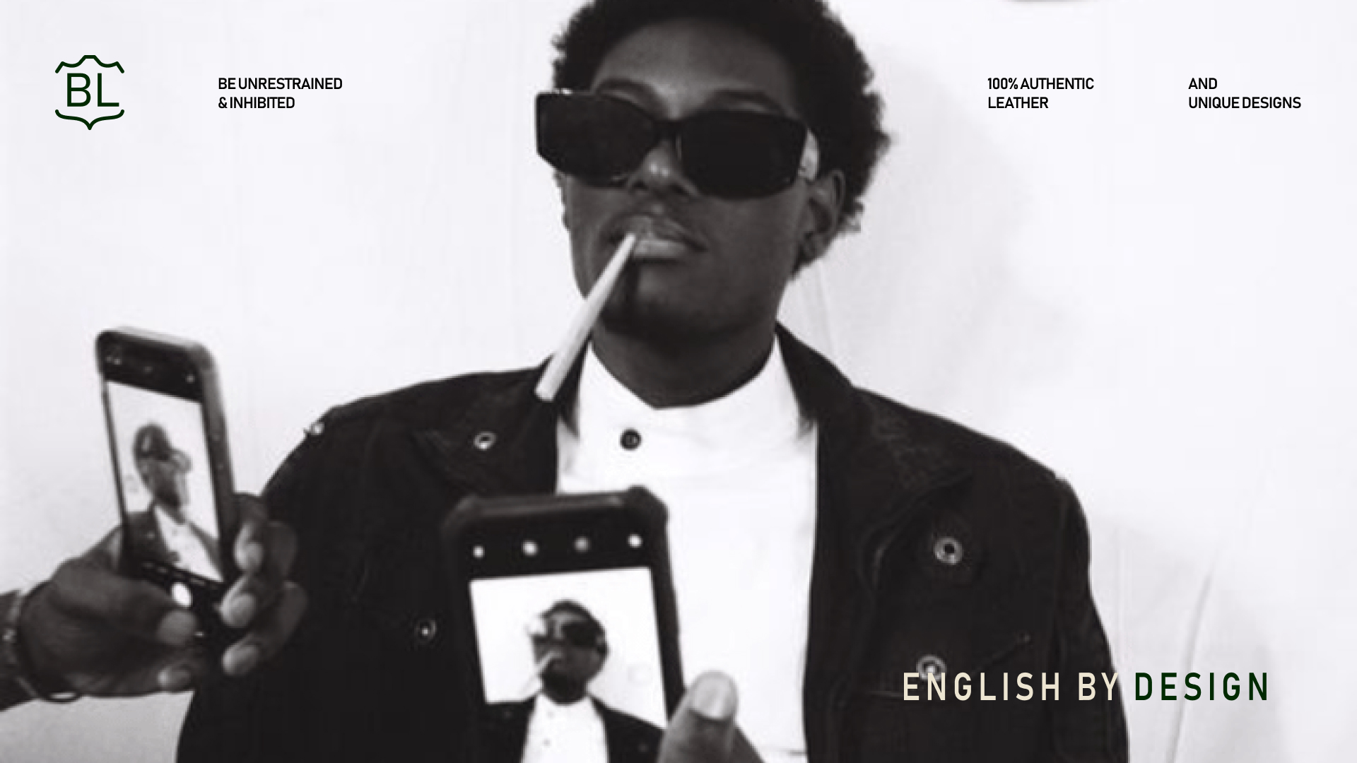
Brampton crafts high quality leather products that are guided by English design sensibilities. Each product embodies a free-spirited and rebellious nature, matching the daring spirit of the young. This project involves creating a unique brand identity, designing a dynamic website, and developing compelling prints to effectively communicate our essence.
Stakeholders
It was essential that I communicate continuously with my stakeholders and seek their feedback on my progress during this project. As part of the brand development process, I sought feedback from clients to align with their goals and visions.Further feedback was provided by the creative director.
Context
Logo
The logo is minimal and incorporates leather cut-outs in the shape of brackets around the initials. The brackets will extend into the design language and across different products, giving the brand a distinct and easily recognisable pattern. The simplicity of the logo and the emblem created with the initials make it versatile and high on adaptability. It comes in 5 unique renditions that can be used across different marketing collaterals, as well as on various areas of the product.
DESIGN
Identity
Typeface & Color
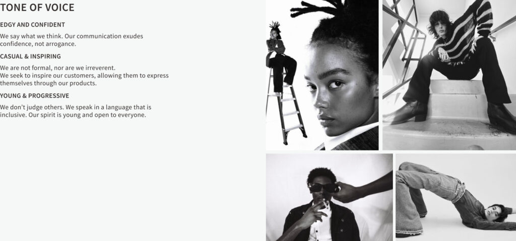
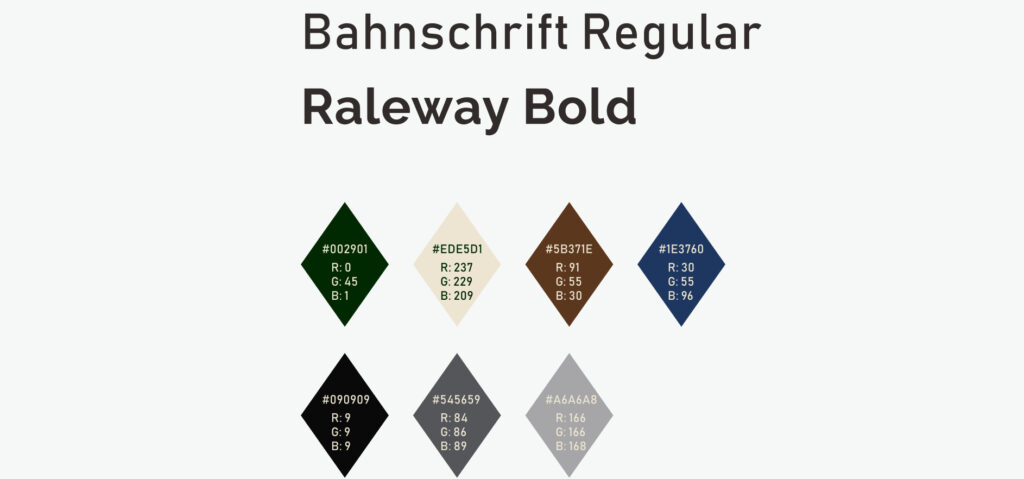
The typeface boasts a clean and elegant aesthetic. It achieves an optimal readability score, making it equally suitable for large and small screen sizes. The colour palette is comprised of rich, dark tones that convey a feeling of refinement. Through the use of these colours, the brand embraces a visual language that resonates with a young audience, captivating their attention and establishing a strong connection with them.
DESIGN
Identity
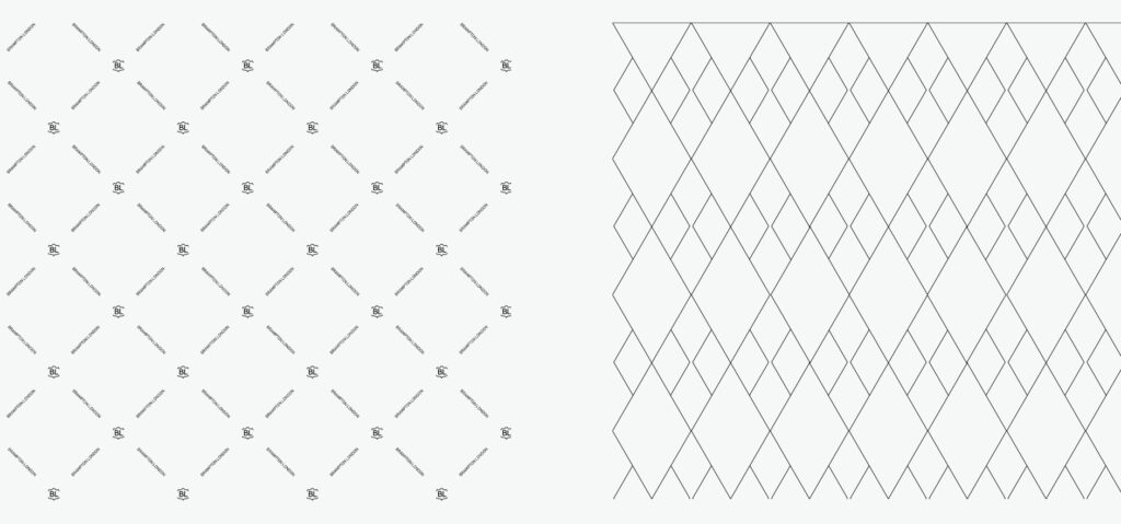
Patterns
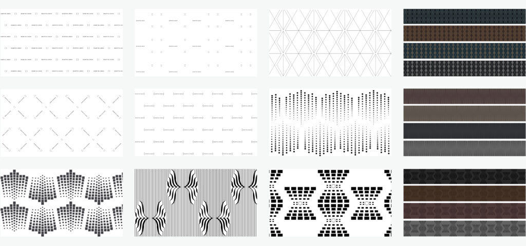
The ideation process for the pattern began with a deep exploration of the brand's essence and values. It was vital that every aspect of the pattern is distinctive and adaptable to diverse materials across the range of our products, keeping the edgy appeal.
DESIGN
Process
Patterns Developed for Products
The Bramptop London pattern adds a distinctive and captivating element to the visual identity. It incorporates textual as well as graphical elements to serve as a unique design motif. Its usage will bring a sense of cohesion and consistency, ensuring a memorable brand experience. The pattern is a powerful visual symbol that further strengthens the brand’s visual identity. It adds a layer of depth and enhances its overall aesthetic appeal
DESIGN
Process
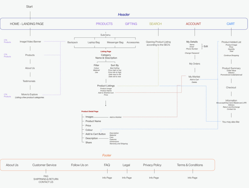
Sitemap
In order to deliver a client-friendly website, we begin the process of web design with sitemaps. This document outlines the structure, hierarchy, and navigation of the website. It promotes clear communication and a collaborative approach.
IDEATION
Web Design
Wireframe
Before making wireframes, I began researching the existing competitors in today's market to see what their proposition was and how Brampton London can be differentiated among them. We then took a look at a design inspiration moodboard to convey the right tone, look, and feel — this gave me a better understanding of what the clients were drawn to and how they wanted to visually represent their brand digitally.