The project featured a straightforward brief emphasizing comfortable protection as a value proposition, a message we aimed to convey through our visual design.
Embodying the spirit of ‘Tough Jobs Need Tough Shoes,’ here is a comprehensive project for Ryno Safety, where designs exuding strength, durability, and reliability were crafted by carefully considering the brand’s identity, values, and target audience.
Contributed to the desktop design along with the visual identity for the brand.
Time Frame
Feb - July 2023
Skills
Logo Identity
Packaging Design
Web Design
Teams
1 Creative Head
1 Designer
1 Copywriter
2 Developers
Overview
This brand specializes in producing and trading safety products, particularly footwear. It is initially based in West Bengal, Orissa, and Chattisgarh, with plans to expand globally in the future. The brand is built on the core values of protection, comfort, value for money, longevity, and reliability. We crafted a logo, an informative website and foundational packaging designs for the brand.
Stakeholders
This project required me to continuously communicate with my stakeholders and seek out feedback on my progress. I sought feedback from developers to identify any limitations or restrictions and proposed solutions. Creative feedback was provided by both the creative director and the client.
Context
User Analysis
Indirect users include factory workers who need protective boots that can be comfortable and sturdy. In addition, the buyers, including business owners, safety managers, importers, wholesalers, and company managers, are seeking cost-effective solutions.
RESEARCH
Primary
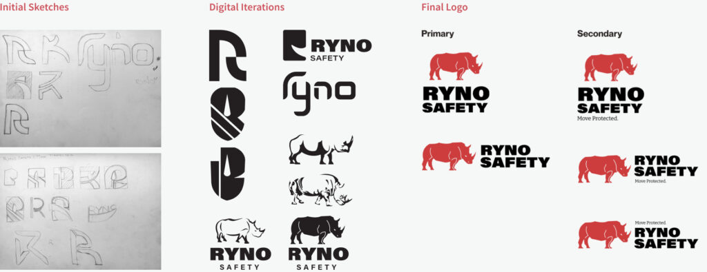
Icon, Typeface
The rhinoceros emblem represents strength and reliability. Inspired by this magnificent animal, the tagline "Move Protected" honors its mobility and power, highlighting the brand's commitment to secure mobility. The 'Rhino' character adds a youthful and dynamic element to the brand.
IDEATION
Identity
Prototype
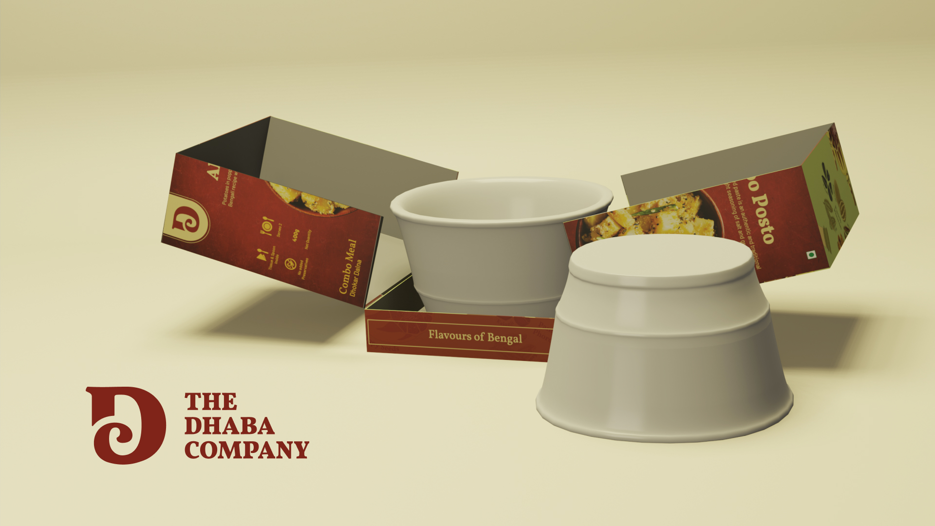
As part of our minimalist design, our packaging features sturdy materials, bold typography, size details, and safety symbols, emphasizing the key features of the product.
Design
Packaging
Iterations
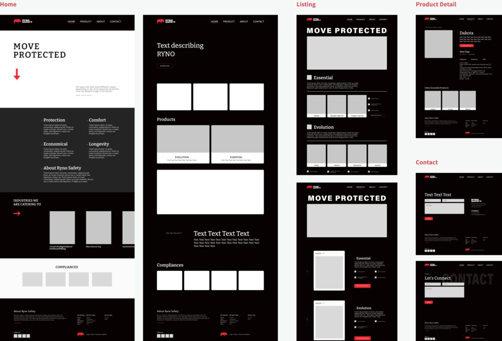
Initial wireframes emphasize a dark theme. However, we carefully considered the readability aspect, recognizing that an abundance of text might be difficult to consume. In the final design, we will maintain a minimal and light aesthetic.
IDEATION
Wireframe
Style Guide
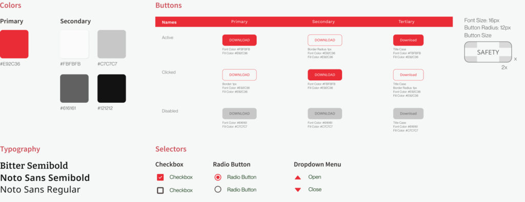
A strong emphasis is placed on bold colors and strong typography to enhance the ruggedness of the design. Buttons are designed with rounded corners to convey a feeling of simplicity and openness.
IDEATION
Web Design
Website
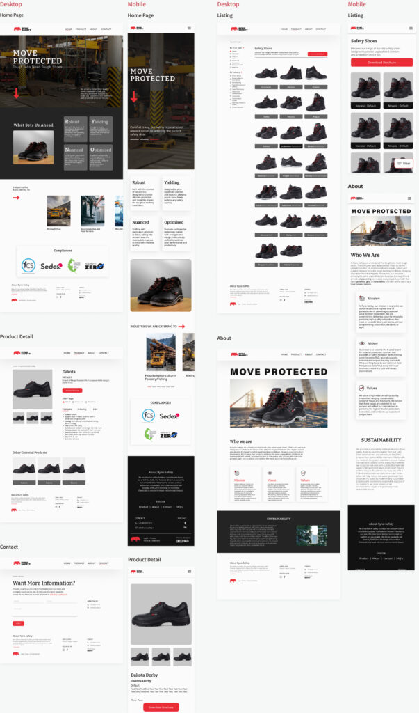
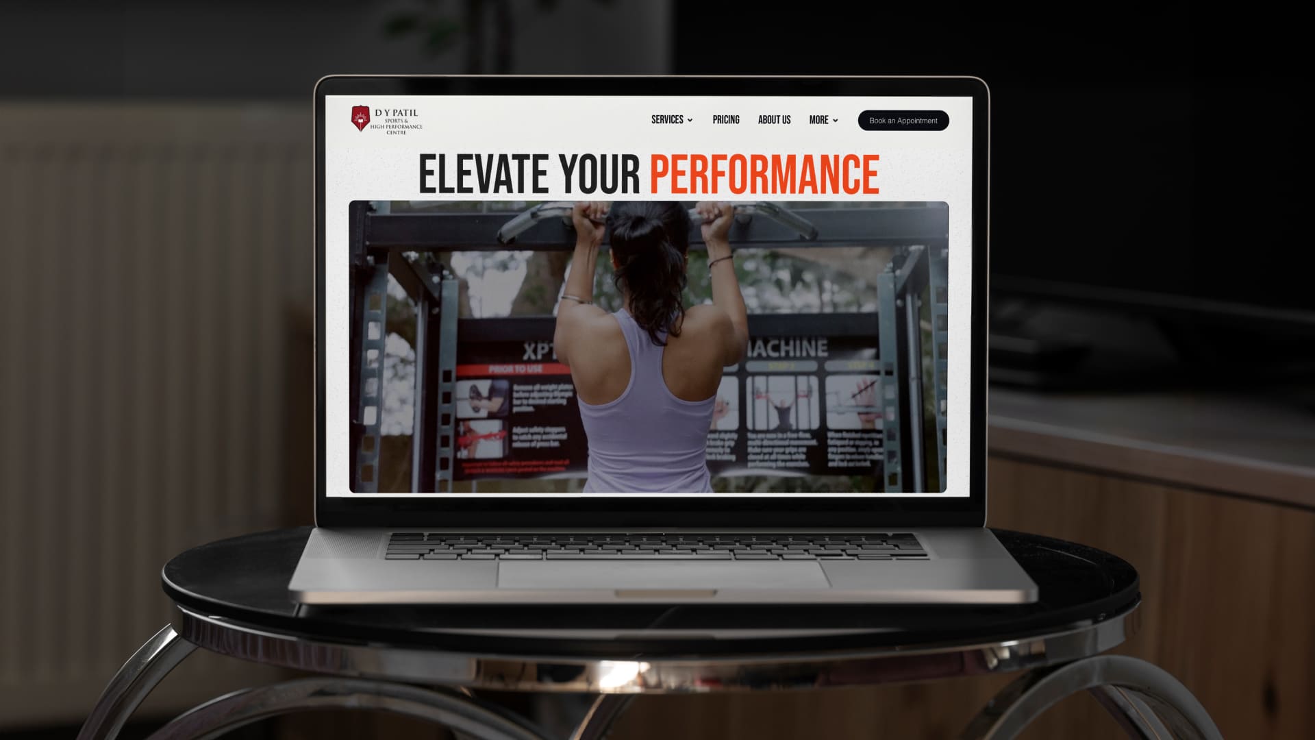
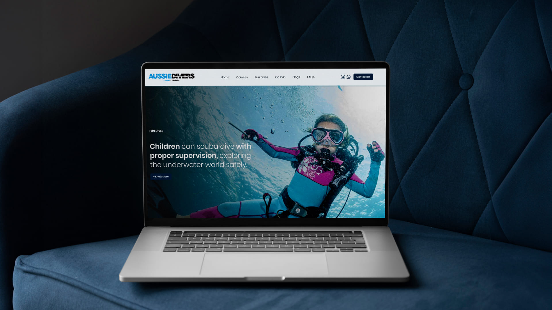
A user-friendly design, high-quality images, mobile responsiveness, and action buttons emphasize durability and safety on this website. The design categorizes information effectively for easy understanding and clarity.
DESIGN
Outcome
Design Goes Beyond Pixels
This project taught me the importance of regular communication with developers to ensure a smooth transition from design to code. It also emphasized the need to ask thorough questions to clients to fully understand their vision. Initially, I created an abstract and modern logo icon. However, I learned that the client wanted a design that would primarily resonate with factory workers, who are the main indirect users of the product.